
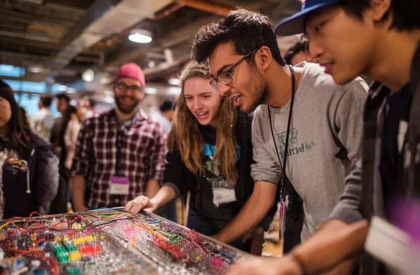
Engineers are trained to make complex things work together under constraints. We balance loads, tame tolerances, and turn ambiguity into reliable outcomes. That same mindset translates surprisingly well to an everyday challenge that looks nontechnical on the surface: designing a temporary environment—an open-day exhibit, a recruitment booth, a hackathon lounge, or even a themed community night. Done hastily, these become cables on the floor and stressed volunteers. Done with an engineering lens, they feel like a coherent product you can walk around in. This article walks through a practical, systems-first approach to small, time-boxed environments, showing how to turn a loose brief into something testable, resilient, and memorable.
Start where any good specification starts: define the mission and the envelope. An event space is a product with a short service life, and the mission should read like a requirements doc, not a mood board. What problem is the space solving? Orientation for visitors? Conversation for recruiters? Dwell time for a demo queue? Once the primary outcome is explicit, the envelope emerges naturally—footprint, power budget, acoustic ceiling, permissible rigging, egress rules, and the realities of load-in and load-out. The schedule is not a footnote. Time is your most inflexible dimension; design as if your critical path has to survive a late courier or a miscut panel and still open on time.
With the mission set, treat the environment as a set of subsystems. Power distribution is rarely glamorous but always decisive. Split noisy loads from sensitive ones, isolate compute and audio from kettle and fan circuits, and create a single, labeled power tree that survives the person who drew it going for coffee. Lighting is next, and it pays to think like an optical engineer rather than a shopper. Color temperature and rendering index decide whether faces look healthy and products look credible. A mid-warm base around 3000 K with targeted accents usually beats bright overhead glare. Ceiling height and reflectance matter more than lumen count; a matte ceiling diffuses better than any spec sheet claims. If you plan to run cameras, treat lighting as instrumentation and budget for it up front rather than squeezing it after banners and snacks.
Acoustics decide whether humans can do the thing you invited them to do. Every carpet tile is a passive filter, every soft surface a friend. Voice intelligibility falls apart in concrete boxes long before anyone complains about volume. The fix is not louder speakers; it is fewer early reflections and fewer competing sound sources. In shared halls, place loudspeakers slightly forward of the audience line and aim in, not across aisles, to keep the spill fragile. A single nearfield wedge for demonstrations beats a wall of sound in most rooms. Measure, don’t guess: a cheap SPL meter or a calibrated phone app prevents the drift that ruins afternoons.
Human flow is just queueing theory in street clothes. People approach, pause, branch, and either engage or exit. If the entry point does not explain the affordance, you’ve already lost half the traffic. A small “orientation module” at the front—three signs or screens that describe what this is, how long it takes, and what someone gets at the end—does more than any brand palette. Paths should bias toward gentle arcs rather than ninety-degree turns to avoid clots. Seating height should match the time you want people to stay; stools keep energy high and dwell short, deep sofas encourage long conversations, and mixing them gives you control over tempo without a word.
Engineers instinctively respect safety factors; keep that reflex. Temporary spaces accumulate unplanned loads: more people than you expected on a small platform, heavier devices on a light stand, cables multiplied by late feature creep. Build a margin into everything the public can touch. If a tripod can plausibly be bumped, sandbag it as if the bump is guaranteed. If a sign might become a sail, plan for the gust. The tidy outcome is not an accident of taste; it is a by-product of force diagrams that close.
Materials and finish can be chosen with the same logic you’d use for housings or enclosures. Surfaces below elbow height should be impact-tolerant and easy to clean; surfaces at eye line should be low-gloss to prevent specular distractions in photographs. Fasteners should be reversible but tamper-resistant; wood screws are for prototypes, threaded inserts are for the second build. If you must choose between one hero object and a field of flimsy filler, choose the hero and give it a halo of empty space. Emptiness is not failure; it is bandwidth for the thing you meant people to see.
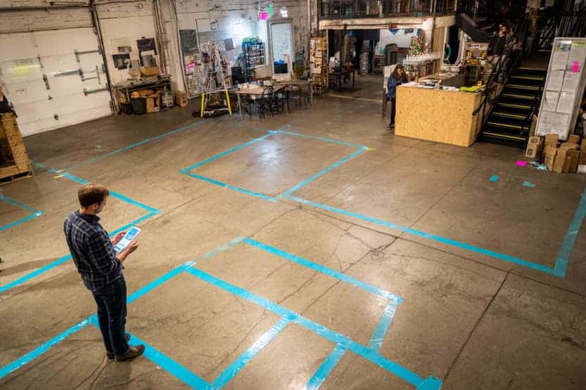
Every good design invites test loops. Time-box a micro-rehearsal at half scale before you order anything you can’t return. Mark gaffer-tape footprints on a garage floor to learn what will and won’t fit through your venue’s doors. Run a five-minute “visitor” through the flow while you hold a clipboard and pretend you’re a processor watching latency spikes. If you detect a stall—too much text, too many taps, a staffer who turns into a single-point failure—address the bottleneck as you would in software: reduce steps, add caching, or parallelize the path. The very act of dry-running will reveal missing cables, mismatched power, and that one adapter you promised yourself you’d remember.
Communication and orchestration are just as engineered as trusses and trim. Script announcements and hand-offs the way you would write log messages. If a volunteer is the interface, give them a single sentence that does the job of a landing page. People mirror the confidence and clarity they receive. If you need a moment of ceremony—say, the instant you move the crowd from mingling to demo—use a small audio or lighting cue that feels like a state change rather than a scold. A tasteful stinger and a fade in house lights are systems events, not decorations.
This is where an unexpected source of inspiration is useful. Themed family events often solve flow and attention problems with elegance because they have to work for children, grandparents, and cameras simultaneously. Treat a well-made Harry Potter décor guide as a structural template: clear scene-setting, small lighting schemes, and strong visual anchors. Use the architecture, not the theme. Borrow the structure, not the props. Treat the “Great Hall” table as your demo spine, the “Sorting” moment as your orientation cue, and the “photo nook” as your analytics event that tells you whether the space performed. When nontechnical creators converge on patterns that keep strangers engaged and moving, pay attention—their constraints are simply different names for ours.
Reliability in short-lived environments comes from the same playbook as reliability in long-lived products: redundancy where failure is catastrophic, graceful degradation where it is not, and observability everywhere. Carry two of anything that can halt the show, from HDMI to gaffer tape. Label both ends of every cable with human words, not just colors, because you will be tired when you are tracing them. Keep a written run-of-show at the welcome point so someone who was not in the planning channel can step in. If you expect to run media, store it locally as well as on the network, and set devices to airplane mode if the venue Wi-Fi is a liar. The most professional thing you can do with computers in public is to prevent them from asking the internet a question in front of an audience.
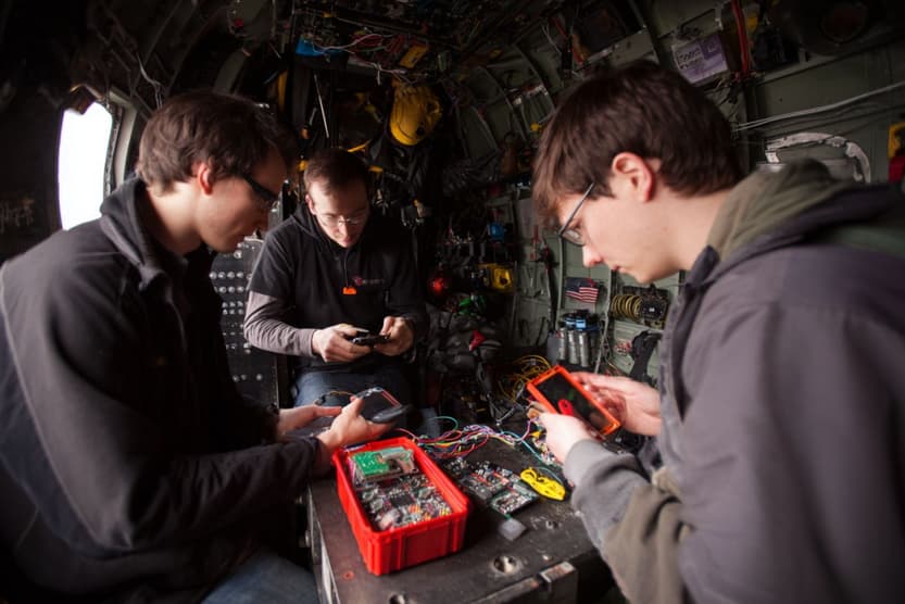
The day itself should feel like a calm algorithm. You will be tempted to add features mid-flight; resist unless they increase resilience. If something misbehaves, debug in layers: power, physical link, configuration, content. A broken asset is the last place to look, not the first. Keep a tiny kit of solve-it-now parts on your belt and a larger box within a walk. The audience will forgive a pause if your posture says the system is under control; they will not forgive a shrug.
When you close, run a short retrospective before the cables are fully cool. What element earned smiles per dollar? Which asset never got noticed and should be cut next time? Did you over-specify light and under-specify sound, or vice versa? Write three lines to your future self while the room is still smelled and felt, not just remembered. Those notes are the cheapest redesign you will ever buy.
Engineers sometimes dismiss this work as soft, but there is nothing mushy about a system that routes humans through constraints with grace. A pop-up that opens on time, explains itself without a handler, and sends people home with the right story is a machine that did exactly what it was designed to do. We have the habits to build it: decomposing problems into subsystems, sizing margins, testing early, observing real-world behavior, and caring about the interfaces between things. Treat the space like a product, not a poster. Design the light field, the sound field, the flow field. And when you need an unexpected spark, scan the best low-tech playbooks, even from places you wouldn’t usually browse. The result is not decoration; it is engineered experience—repeatable, debuggable, and good enough to ship again.